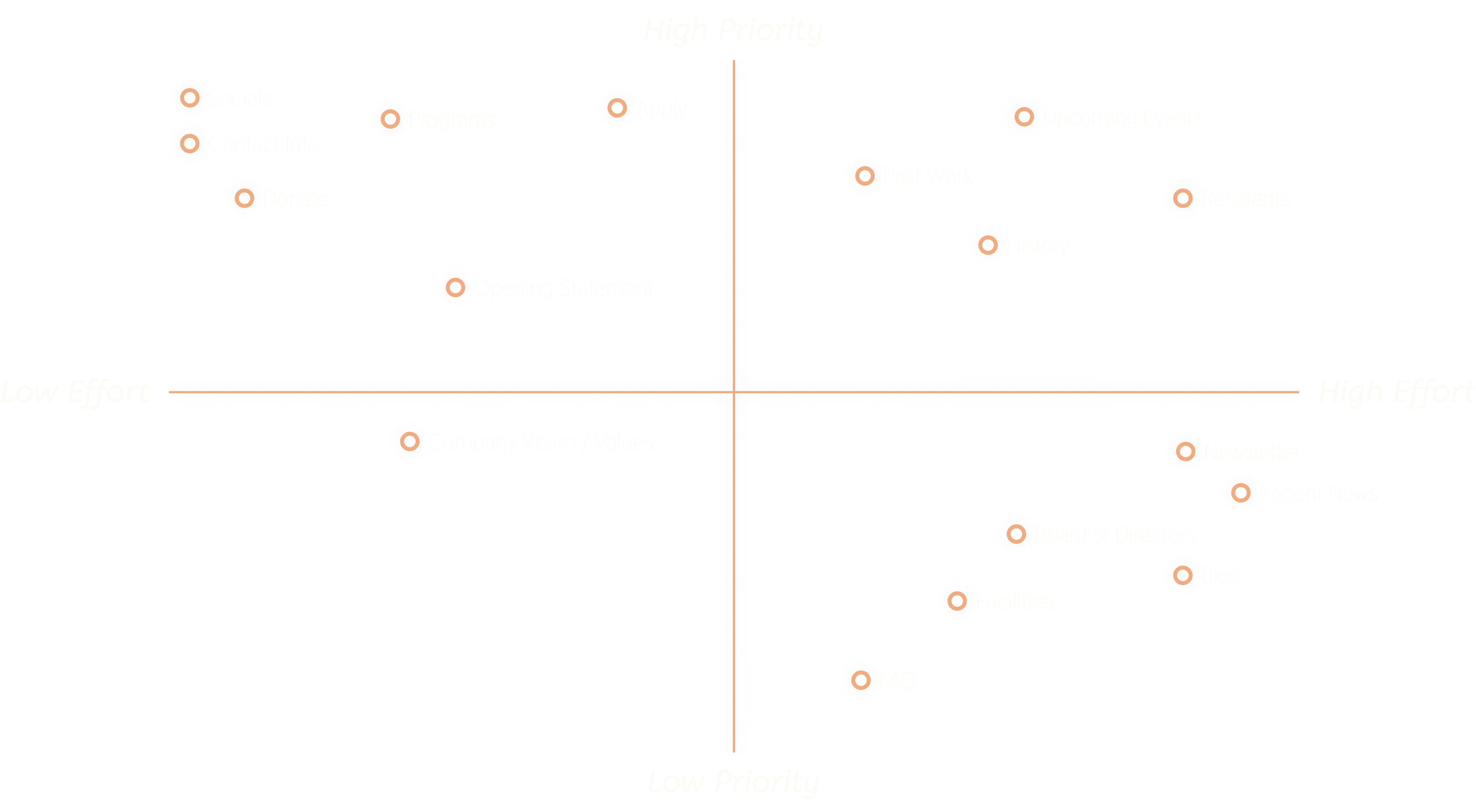
portfolio about contact

Laboratory Website Redesign

A Clearer Path to Laboratory

Client Name: Laboratory

Platform: Website

Time Frame: April 2021 - November 2021

Figma Project

Project Description

LaboratorySpokane.com is a website that gives information to artists that are interested in residency programs. It makes finding information on the non-profit much easier with a clean, easy to use interface. I created this independent project using Figma.

Major Tasks & Responsibilities

  • User Research
  • Prototyping
  • UI Design

Project Goals

Create a clean, easy to navigate website that showcases the spirit and opportunities provided by Laboratory.

The Problem

The original Laboratory Spokane website struggled in many different areas. It was very hard to find certain information because of how the website was set up. It was confusing and had no clear direction of use. If someone who had no idea what Laboratory was, was to look at the website, it would not give them much help. The website also did not properly showcase the work that they have done in the past. That is something very important for an artist residency to showcase to have future residents and supporters.

Competitive Analysis

The client wanted a website that showcased the work they have done, and a website that made young artists want to apply to the residency. I looked at many different artist residency websites to get an idea of what worked for this kind of art/technology non-profit. The Bemis Center was a huge inspiration for my redesign.

Prioritize Plotting

To reach all of my goals for the website, it was important to consider all the information that could be on the site. I created a list of everything the site could offer, and then I did a prioritize plotting to see what was most important. While this was a way for me to see what information I should start with and how much time would go into it, it was also a way to figure out where that information should be on the site. The information that is more important should be up front and center so that it is easier for the user to find.

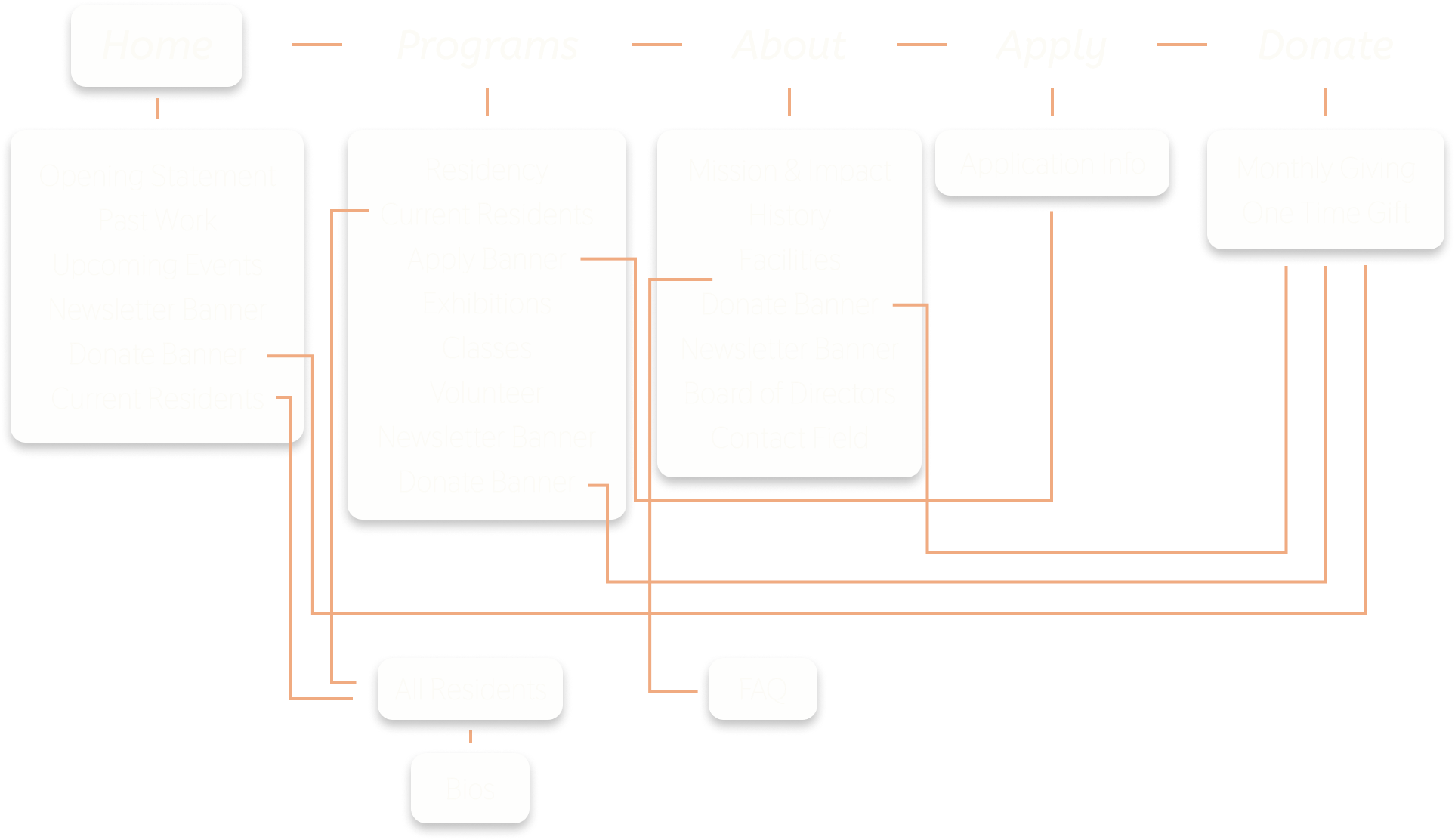
Information Architecture

After the prioritize plotting, I created an information architecture to plan where each section of information would be found on the site. I decided on what the main pages would be and what order the information would be in on those pages. The lines between the pages are where links to outside pages would be.
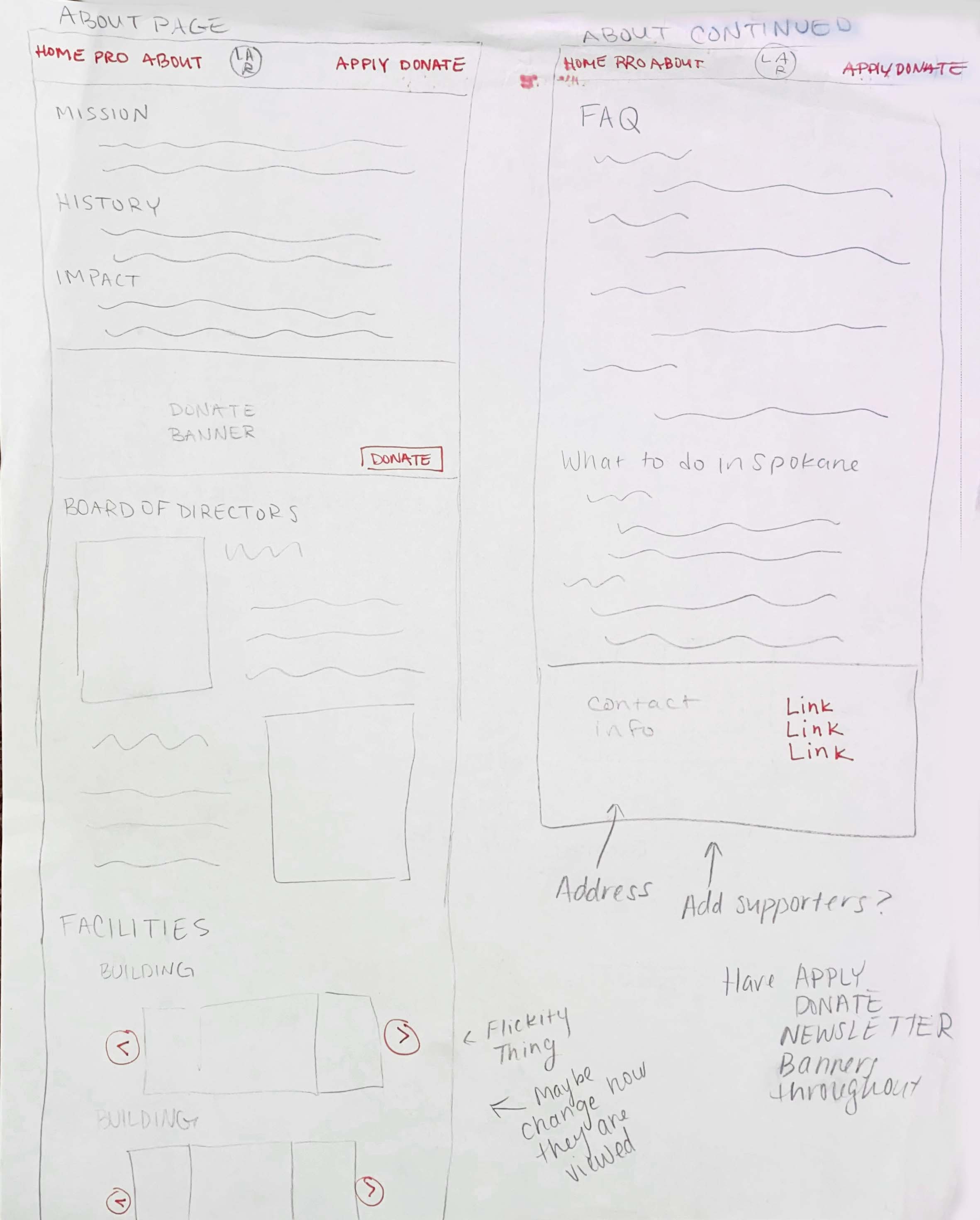
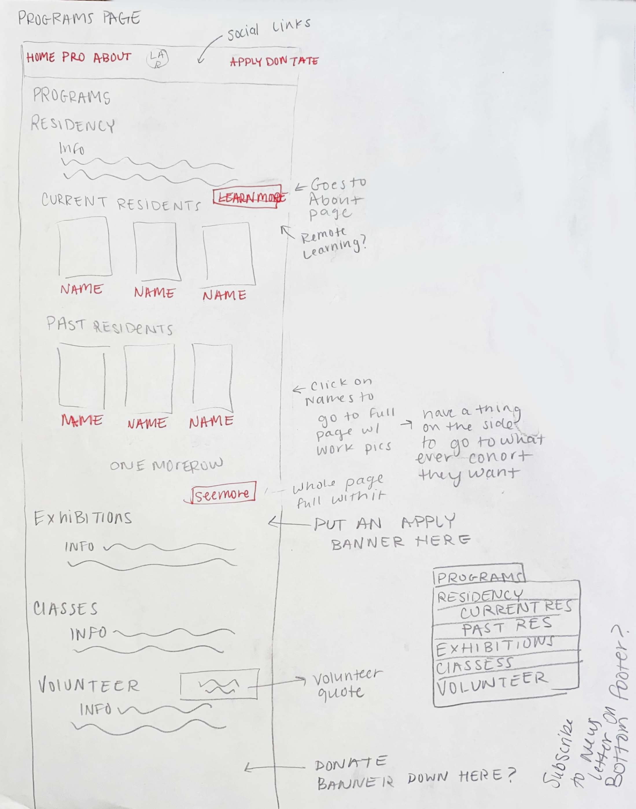
Sketches

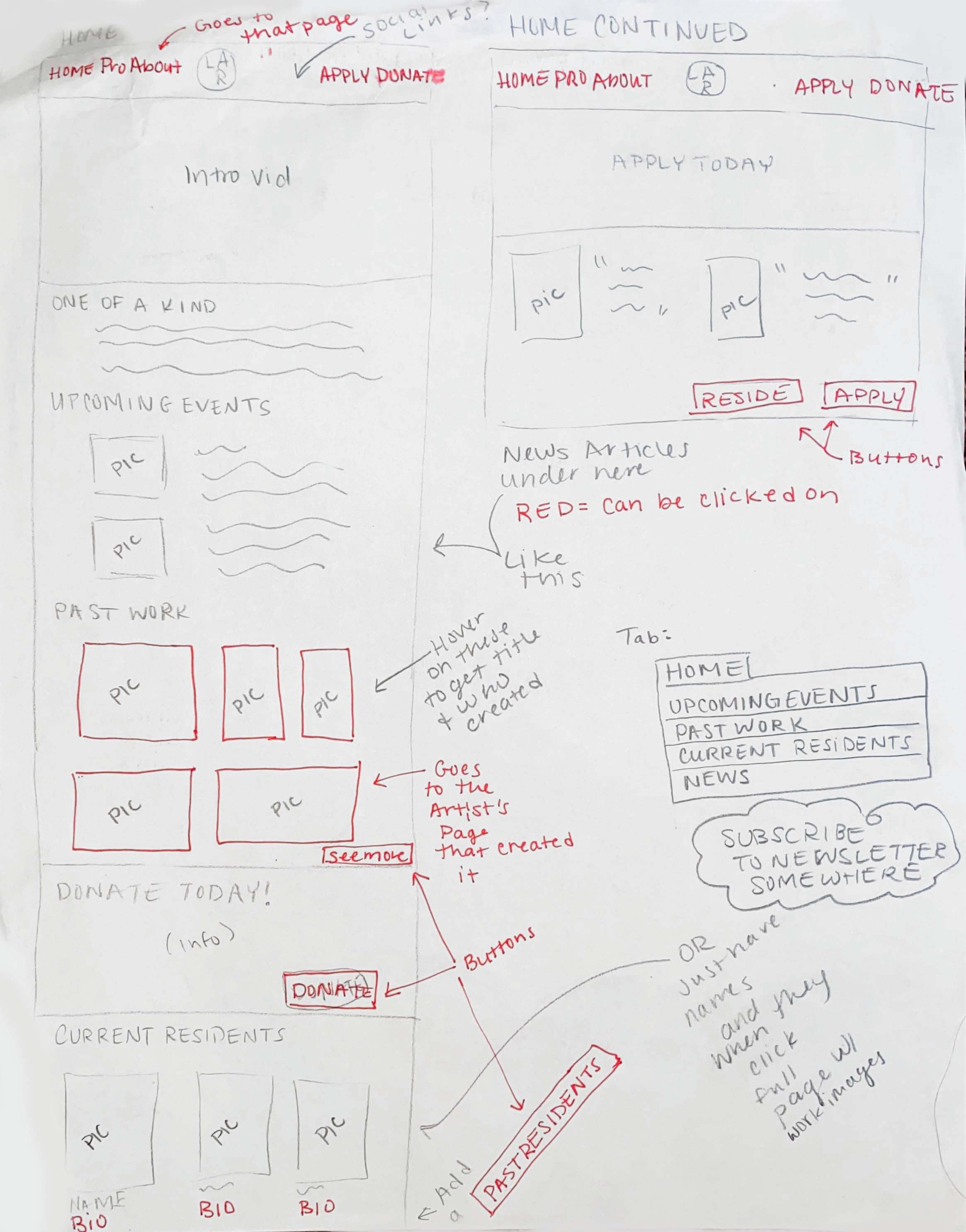
Once I knew the content of all my pages, I began to sketch out different layouts for the site. I created clear sections and made sure that it would be easy for the user to navigate the site, and understand what Laboratory was in the first place.
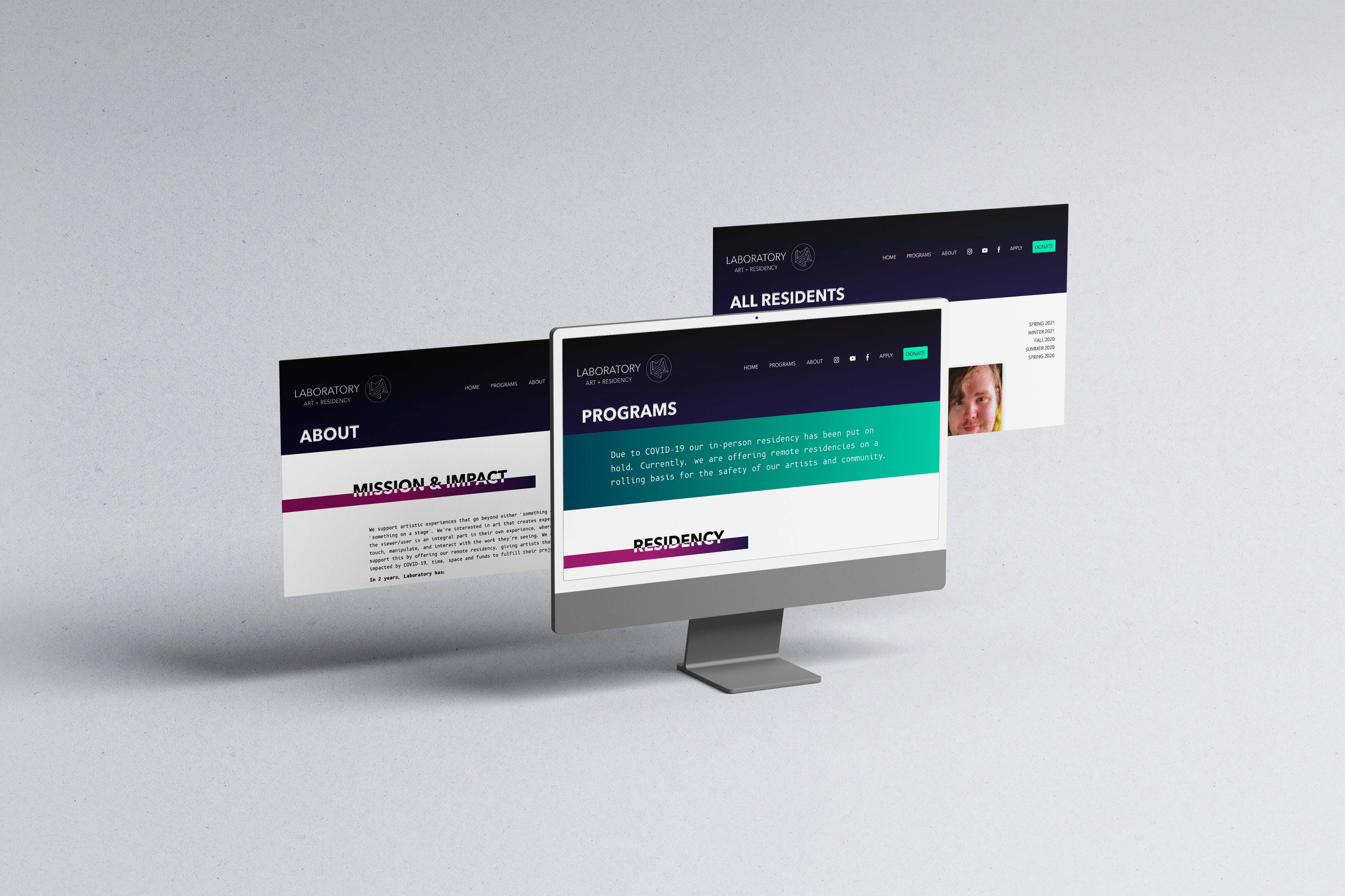
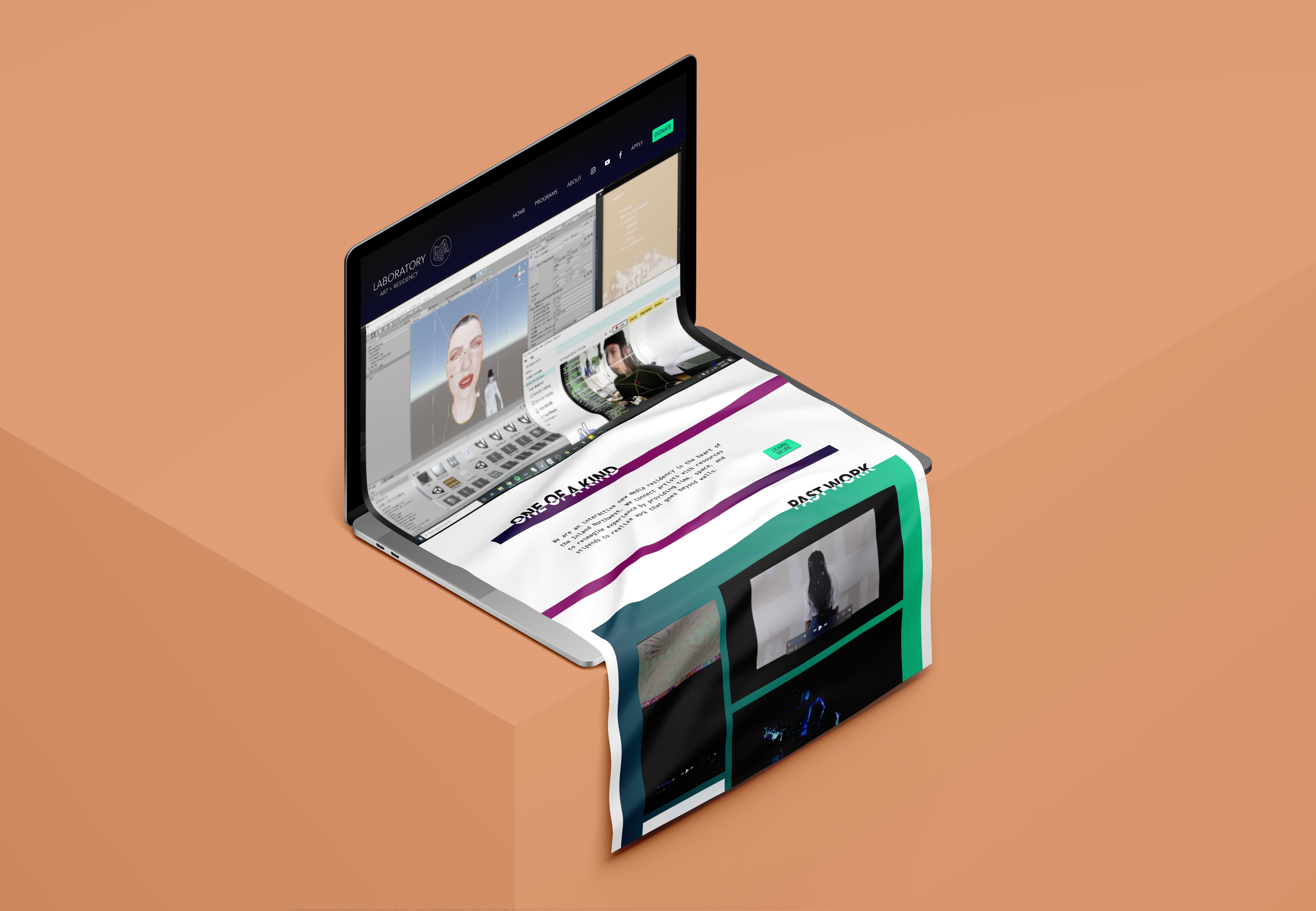
Style Tile

Laboratory's slogan is "The Intersection of Art and Technology", so I wanted to make sure the style of the website resembled that. Laboratory has an overall theme of futuristic. I chose these colors because they have a futuristic techy feel to them. I chose to use a lot of gradients because it gave the website a sleek modern look. The logos were pre-existing and fit the theme well. I used the pre-existing fonts as well but added B612 Mono to add to the tech theme.

Version 1

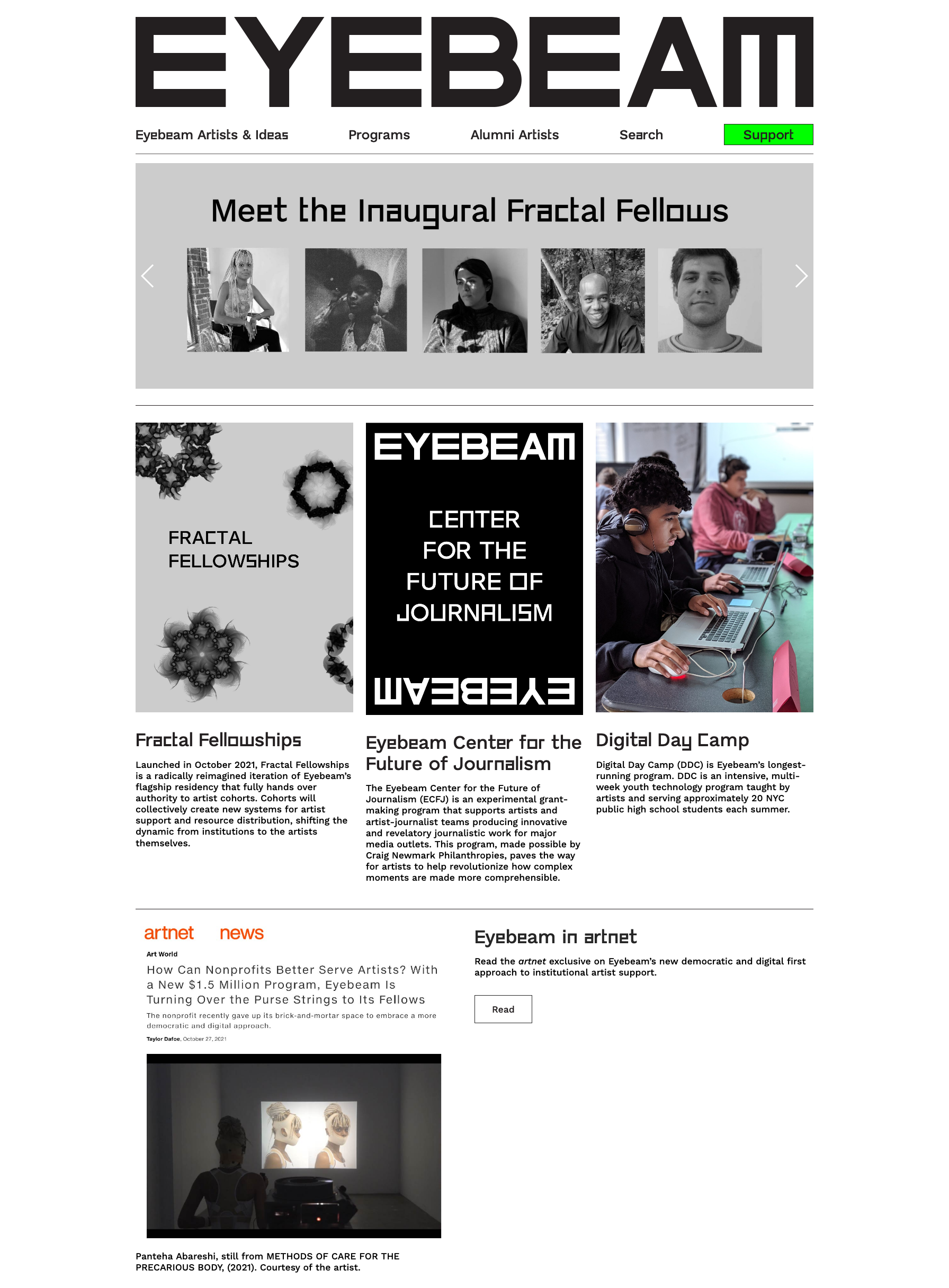
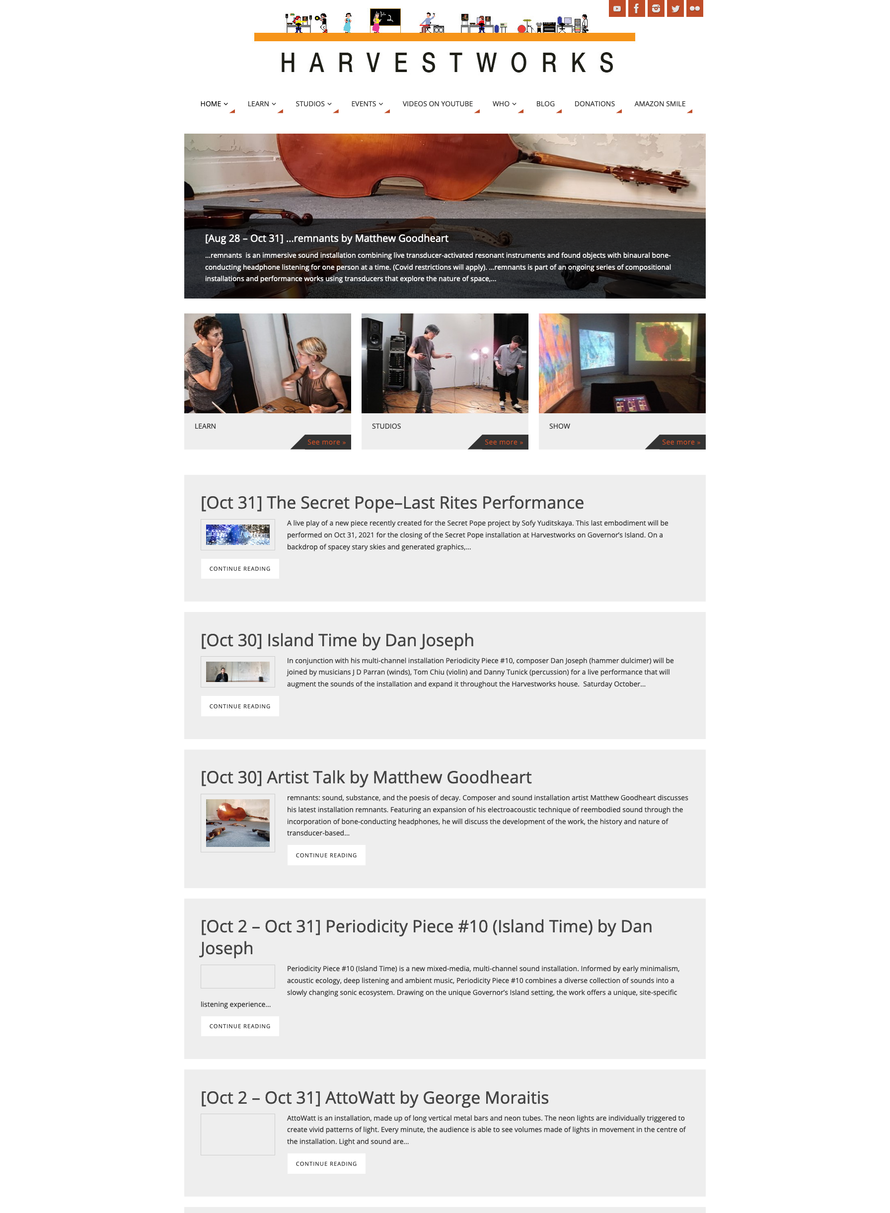
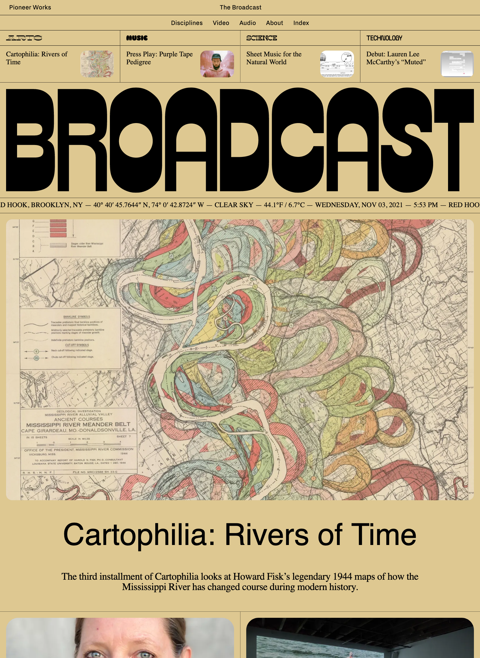
This is the first version of the Laboratory Website that I completed. I created a simpler layout that is easier for the user to follow. Before it felt like searching through a maze to find the information that was needed, but now it is easy to navigate and find what you are looking for. The website now showcases different work that has been completed in the residency. That was an important aspect that was missing in the original. I also added an upcoming events section, so the user knows how they can participate in the future. Find Version 1 here.

The Redesign Version 2

While version 1 was a big improvement from the original website, there was still some issues that I had with my design. A lot of it felt like it could be taken a step further into a sleeker design. I changed the layout and style for all the upcoming events and resident head shots and changed the buttons. This created a more cohesive design throughout the site. I also added some flickity sections for past work and the facilities,, so that looking through pictures would be a cleaner easier task. Version 1 also felt a little crowded and too wordy. I updated the titles to make it cleaner and simple, cut out some of the unneeded text, and changed the formatting on some of the text that needed to be there. Find Version 2 here.

Project Summary

This project was the first time that I designed an entire website with multiple pages. It was very overwhelming at first because of the amount of information that needed to be included in the site. Finding proper ways to display all the information in a clean, organized way was definitely a challenge.

Figma Mockup: Version 2