portfolio about contact

wikiHow App Redesign

Looking for Instructions is Now a Smooth Process

Client Name: wikiHow

Platform: Mobile App

Time Frame: April 2021 - Oct 2021

Figma Project

Project Description

The wikiHow Redesign is an app that shares how-to instructions for anyone needing information on a wide range of topics. It removes the pain of vague instructions with a sleek interface that helps you find any topic you need, or even explore other ideas. I created this as an independent project using Figma.

Major Tasks & Responsibilities

  • User Research
  • Prototyping
  • UI Design

Project Goals:

The goal of this project was to create a new wikiHow app that is easy to maneuver and aesthetically pleasing.

The Problem

The original wikiHow app had everything from a poor UI design to a mundane style. The app also lacked a lot of the important features for the user that you can find on the website. The way that the app was set up was confusing, and it made it hard to find the information that I wanted. My plan for the redesign was to make the app pleasant to look at, as the user is easily able to explore what the app has to offer.

The Research

To start off my research, I went on the wikiHow website to find all of the features that were lacking in the app. The website had more features than I knew, so I had to pare down what features I wanted to have in the app.

Original App Audit

I then did an audit on the current wikiHow app that is found in the app store. The whole app felt very dated and like it was not curated for the user. There were not many options for the user to explore the app without having something specific they wanted to search for. There were also issues with the organizational aspects of bookmarks and other categorized articles.
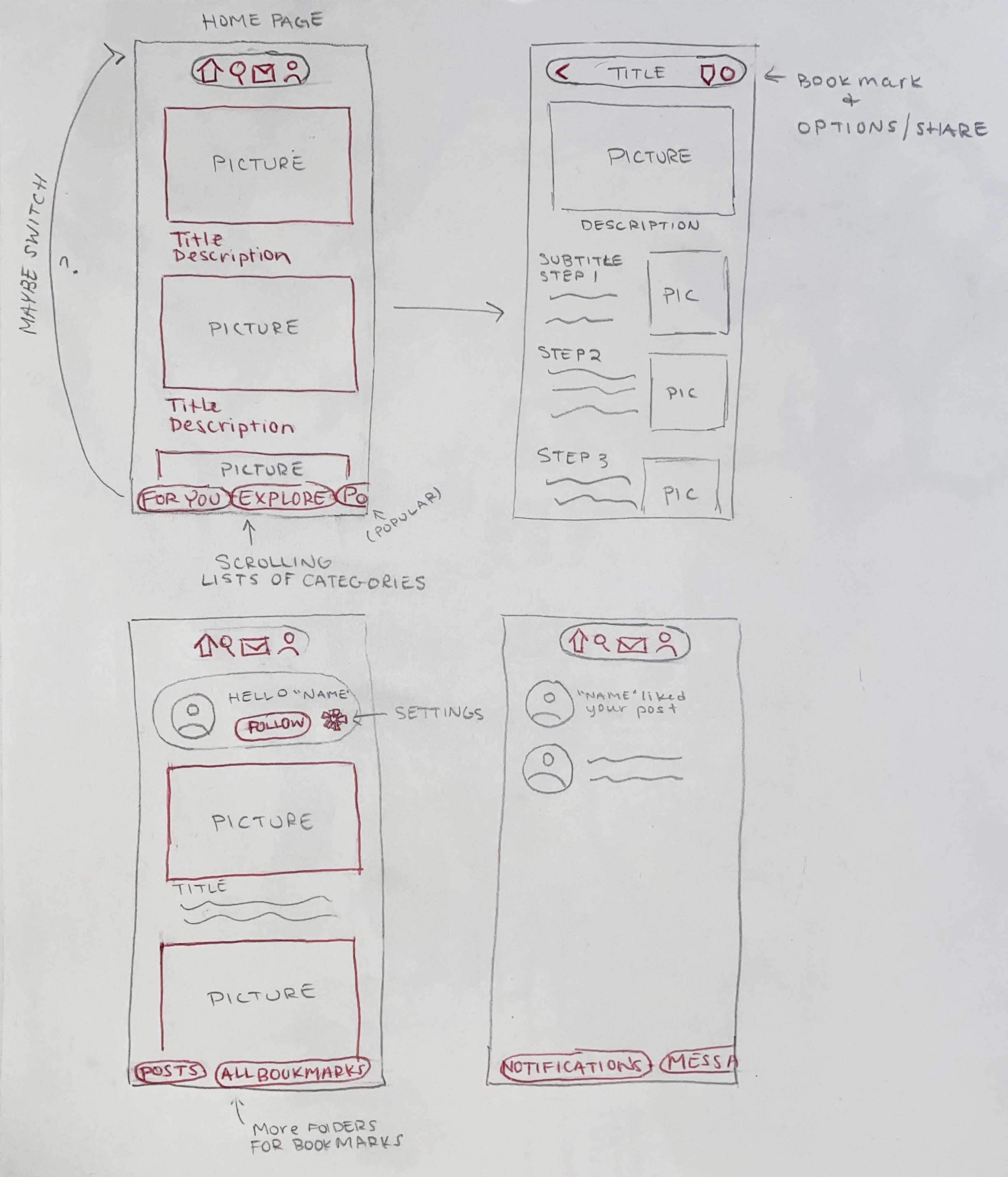
Sketches

I knew I wanted something much more modern for this app, so I began to sketch out different layouts that would create a cleaner UI. I also looked at other mobile apps to see what the best kind of UI was for an app with so much browsing information. The layout I chose to move forward with was heavily picture oriented with rectangular buttons and a bottom navigation bar. A huge inspiration for this layout was the Pinterest app.

Style Tile

I wanted the color pallet for the app to be very minimal and sleek. There is already so much information on this app, I thought that it was important to not overwhelm the user with a lot of bright intrusive colors. I also wanted to stick with a similar kind of green that wikiHow is known for. I ended up with a fresh, rich color pallet containing different shades of greens and blue greys.

Design Constraints

I set design constraints for myself to push myself to be creative with a limited set of components. The constraint I set for myself was to use a UI Kit I found on Figma, called the Daresay Mobile UI Kit. The redesign was completely based off this UI Kit. Often in the line of work I will be given brand guidelines that are already in place, and this was a great way to prepare myself for that.

Version 1

This is the first version of the app that I completed. I changed the layout of every page the app had to offer. I also added a feature for the user to log in and create a profile. This is available on the desktop version, but was not included in the app. I also added bookmark folders so the user can organize the articles they would like to save. Instead of having a long scrolling page for the articles, I added a step-by-step layout where the user can click forward or backwards to a step. Find Version 1 here.

Version 1 Audit

When looking at the first version I created, I wasn't completely happy with the results. The prototype was lacking in professionalism. The colors of the frames fell flat, and certain buttons felt chunky. It did not have the sleek modern feeling that I was looking for.

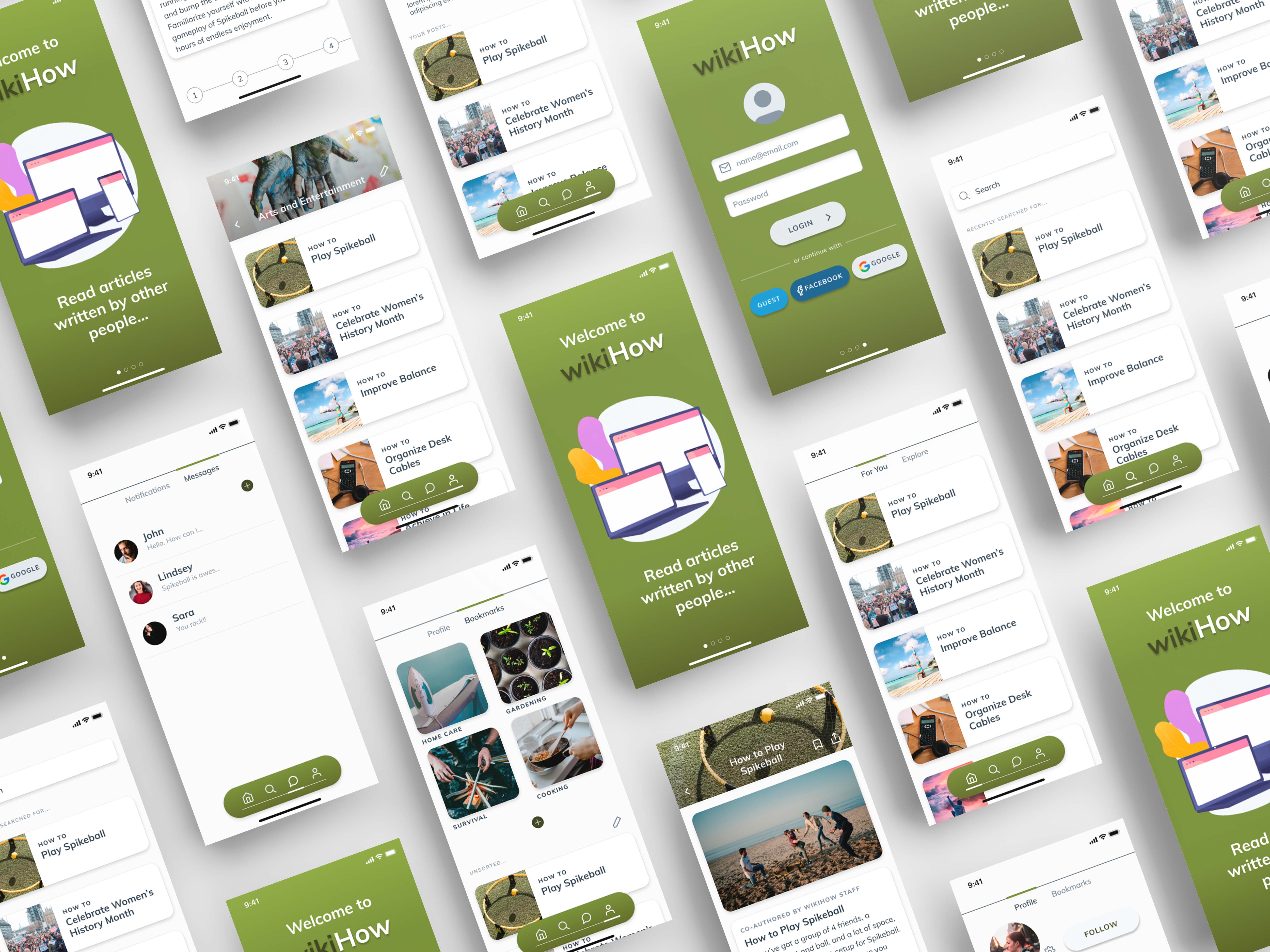
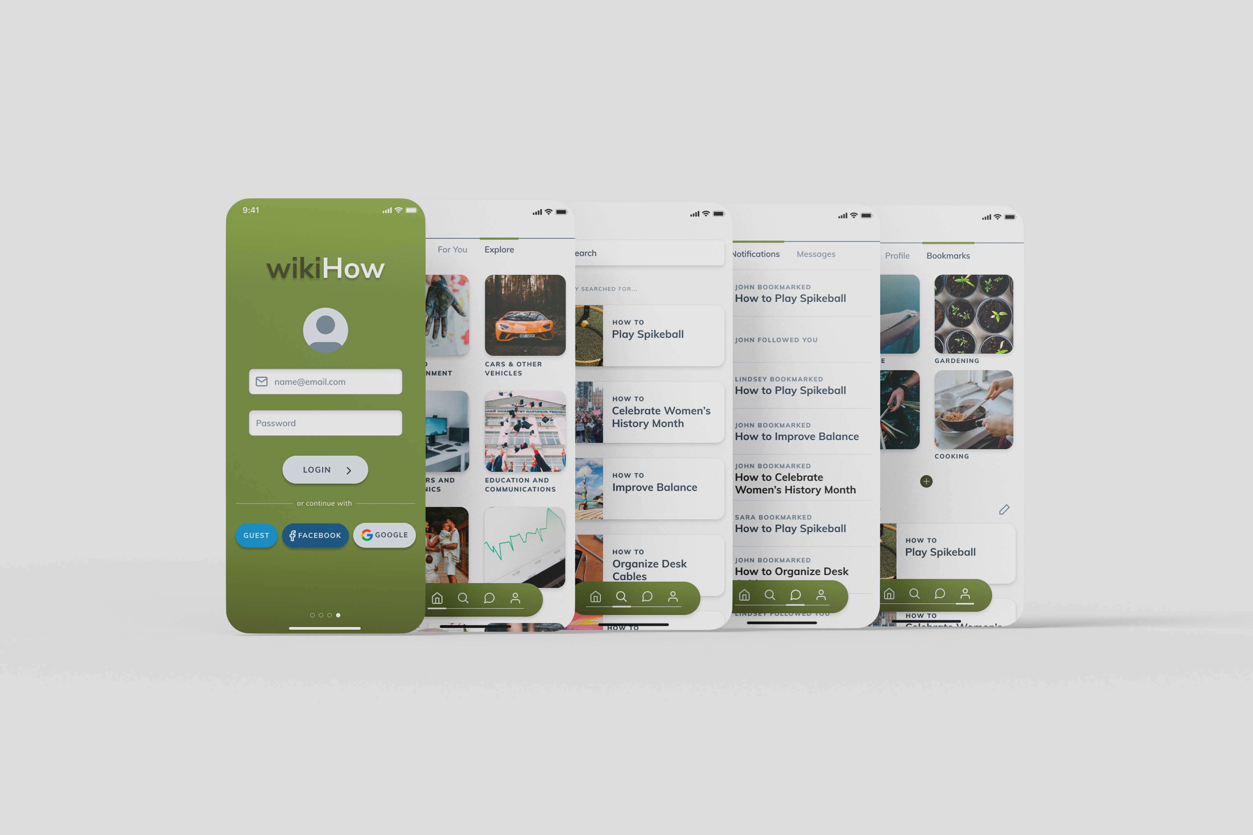
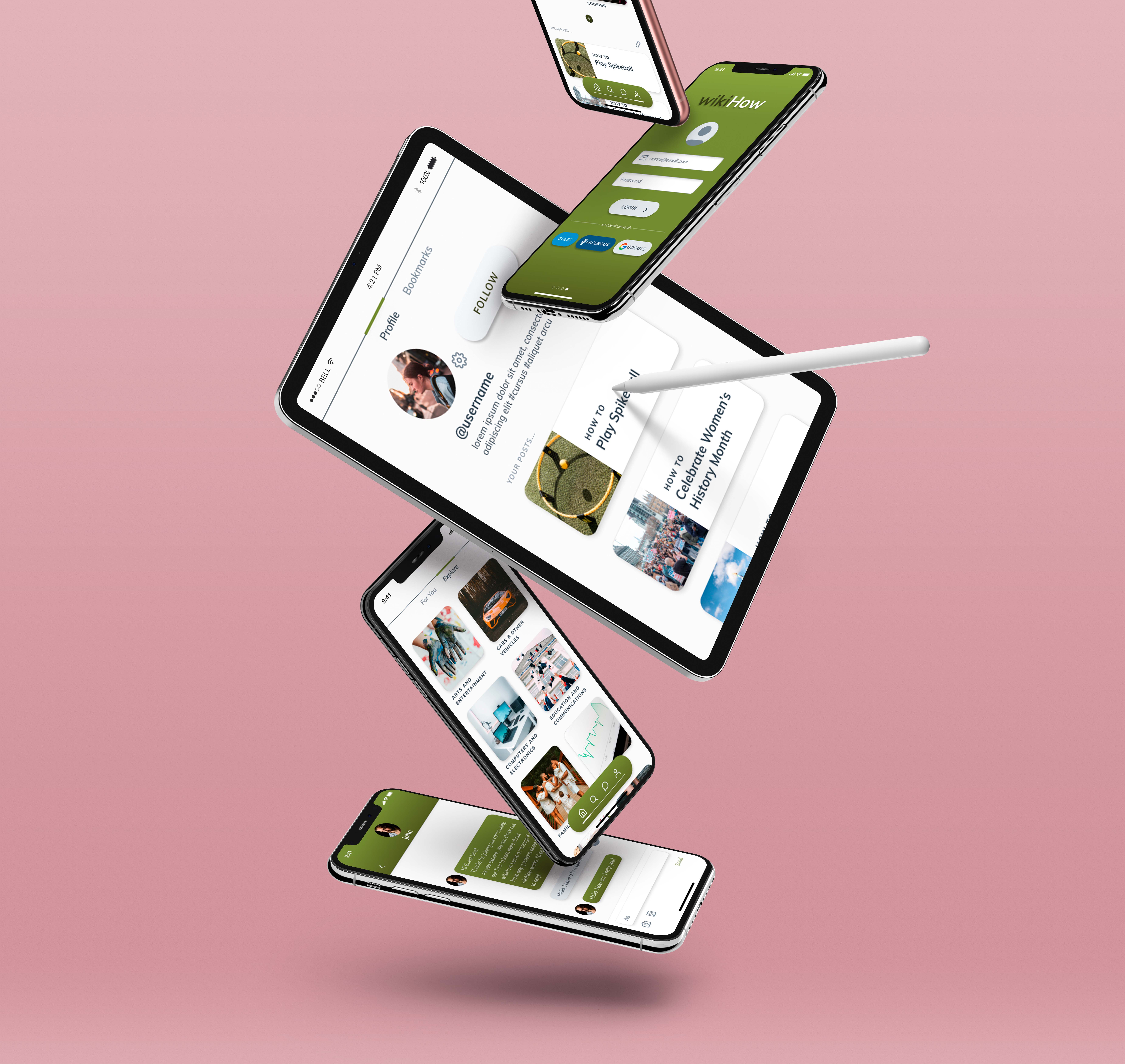
The Redesign: Version 2

I am very pleased with how my second and final version turned out. I fixed the issues that I had with the first version by removing strokes around picture buttons and adding gradients to the colors to add depth. I also added images to headers to create more interesting screens, while keeping the app clean. Find Version 2 here.

Project Summary

The main challenge in this project was to create a UI that was simple, but still offered all the tools that wikiHow provides. Through many iterations, I was able to create a sleek design that is easy to navigate, without losing any of the important features. I am happy with how the app turned out, and I think it is a great turnaround from where we started.